top of page
Create Your First Project
Start adding your projects to your portfolio. Click on "Manage Projects" to get started
Analytics That Speak Value
Project
Redesigning Performance Analytics to Drive Retention and Value Clarity
Problem
The business transitioned from selling standalone marketing products to bundled solution packages to increase retention, reduce churn, and improve profitability. However, the Performance Analytics (PA) tool failed to communicate the value of these solutions, resulting in:
- Low customer engagement (~6% MoM)
- Unclear lead attribution
- Fragmented reporting
- Diverging needs between mobile business users and desktop-based care teams
Internal care teams needed detailed, product-specific metrics for retention conversations, while business customers wanted a simple, mobile-first dashboard to understand solution performance and ROI.
Goal
Redesign the Performance Analytics tool to:
- Highlight the value of generated leads
- Support solution-level insights
- Enhance usability across mobile and desktop
- Reduce support dependency and improve internal efficiency
My Role & Scope
As UX Lead, I directed the end-to-end redesign with a focus on:
- Continuous discovery and user validation
- Strategic prioritization of user needs
- Agile collaboration with cross-functional teams
- Executive stakeholder alignment, including C-suite
Collaborators:
Product Managers | UI Designer | UX Researcher | Engineers | Data Analysts | Internal Support Teams
Research & Insights
Understanding the Landscape
We studied usage data and user behavior across two core personas:
Business Customers (63% mobile users):
- Not marketing-savvy; time-poor
- Needed lead clarity and quick insights
Internal Care Teams (100% desktop users):
- Managed customer relationships
- Needed granular, product-level lead data
Key Findings
- Mobile-first UX was critical for external users
- Solution-level insights were more meaningful than individual product metrics
- Existing UI failed to guide or engage users, leading to friction and support escalations
"I want to see something short, sharp, snappy, visually engaging — with context if it’s good or bad."
— Anthony Spencer, Business Owner
Process
Discovery → Research → Ideation → Prototyping → Usability Testing → Agile Iterations → Internal Beta → External Launch
Methodology
Key Activities:
- Stakeholder workshops to align on business vision
- User interviews with internal and external personas
- Data analysis on user behavior and feature adoption
- Competitor benchmarking and visual inspiration
- Prototyping with rapid iteration cycles
- Dual-track agile delivery (design + dev in parallel)
Ideation & Design - Phase 1: Internal Tool Optimisation
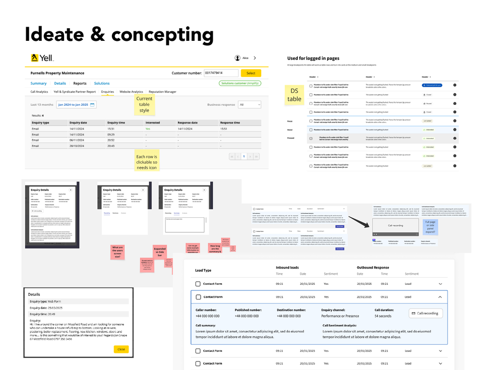
We enhanced the internal UI to support detailed lead insight across calls, forms, and messages. Features included:
- Unified lead table with sentiment analysis and AI call summaries
- Visual hierarchy redesign for faster scanning
- Applied modern visual cues (contrast, icons, spacing)
✅ Result: Internal teams could now demonstrate ROI more effectively and reduce manual reporting time.
Ideation & Design - Phase 2: Mobile-First Customer Experience
We reimagined the business customer view with mobile-first UX at its core. Key design principles:
- Visualise total lead volume at a glance
- Surface supporting data: clicks, impressions, conversion intent
- Use fitness and finance apps (e.g., Fitbit, Crypto.com) as inspiration for data-rich but digestible dashboards
- Progressive disclosure to balance depth and simplicity
Testing & Validation
Methods:
- Moderated testing with internal teams
- 3rd-party unmoderated tests using tools like Lyssna (targeted at self-employed users)
- Comparative A/B testing of legacy vs. redesigned UI
Key Learnings:
- Minor visual updates (e.g., spacing, contrast, icons) had major usability impacts
- Users valued simple, outcome-led terminology (e.g., “Your Response” over “Interested: Yes/No”)
- Disabled tabs created confusion → removed to reduce cognitive load
- Participants wanted clearer next steps and richer contextual insights
Outcome & Impact
Results to Date:
- Minimum Lovable Product (MLP) delivered by the end of Q2 2025
- Feature adoption and positive sentiment from early internal BETA
- Early signs of reduced churn and support dependency
- Cross-functional alignment enabled seamless GTM and L&D support
Internal Feedback:
- 25% rated value experience highly (7–10)
- 50% neutral (4–6), indicating room for messaging clarity
- 25% rated low (1–3), tied to lack of deeper insights (now in development)
Metrics We’re Tracking
Leading Indicators:
- User engagement rates
- Click-through and interaction rates
- Session duration and frequency
- Feature adoption and satisfaction scores
Lagging Indicators:
- Churn rate
- Net Promoter Score (NPS)
- Customer retention and revenue growth
Reflection & Next Steps
Key Learnings:
- Designing for dual personas requires strategic prioritisation
- Small design tweaks can yield high-value perception shifts
- Continuous delivery = faster feedback = better product
Next Focus Areas:
- Launch business-facing version with contextual lead detail
- Add AI insights and lead suggestions to drive upsell
- Further personalise UI for various business sizes and verticals
- Continuous feedback loops via surveys, interviews, and usage data
Final Thoughts
This redesign is more than a UI facelift; it’s a strategic shift in how we communicate value to our customers. By focusing on simplicity, clarity, and mobile-first design, we created a performance analytics experience that drives retention, satisfaction, and internal efficiency.
bottom of page


